Ellsworth Kelly (May 31, 1923 – December 27, 2015)

http://www.history.com/topics/ancient-history/the-egyptian-pyramids

The first time I saw Ellsworth Kelly’s paintings/sculptures I was a high school student visiting Washington DC. The work was direct and palpable. To me the paintings seemed monolithic and akin to the blunt but elegant geometry of the Egyptian Pyramids. I did not know what to make of it. The fact that the work had an author seemed irrelevant. The name Ellsworth Kelly seemed fictional, like a symbol rather than a person I could know. Kelly Ellsworth seemed more accurate. While more informed, years later these feelings lingered. The exact meaning of the shape and color does not hide (there is little attempt at illusion). This caused a mix of pleasure and consternation. While I knew who made the work, color and purity does not have an author.

Now that Kelly has passed away, I am confronted with the question of whether biography matters? I learned that he served in the military and that he studied in Paris. I enjoyed seeing images of him and his studio (here is his New York Times obituary and a recent lecture). With this knowledge, he became a figure of greater depth. While I will never know Ellsworth Kelly personally, I will live with the shapes and colors he fashioned. Kelly’s paintings and sculptures are built from math and precise chroma, but they are also breath. Since I only have pictures, It would be nice to go to Egypt and see if my analogy holds true. However, judging from afar I think there is room to make this connection.

Ellsworth Kelly, “Red Curve.” 1986. Painted aluminum, 120″ x 204″ x 1/2″ (304.8 x 518.2 x 1.3 cm)

For Better or Worse

When one teaches art in the “ivory tower” it shapes one’s practice and when one survives as a gallery artist (one who principly makes a living on sales) this also shapes one’s art. Expectations follow each pursuit. The answer to how the work gets shaped and what the work becomes is a bit less clear. Whether the goal is to be a little sharper, cleaner, or attention grabbing, the goal is to fit in (at least to the extent that an ongoing career is feasible). The context might shift but the psychology is the same. I feel that the impulse beyond the need to survive and make more falls under two branches. One branch is an existential drive (a primal need to build and keep the eyes and hands busy). The latter branch involves a spiritual impulse; this involves a determination to make an inner spark outwardly visible.

Over the past two years, I have been disconnected from teaching and from commercial aspirations. This has led me to question motives and to ask why continue? In a round about way, this question was given to me when I posted one of my recent pictures on Google+. A person I did not know asked (I think sincerely) why I had made the work. I said something to the effect of ‘for the enjoyment of making it’. In this case, the artwork did not have to make sense or be pretty. It was something that I wanted to experience and see.

For the time being, there is no rush, no need to make lots of pictures, and no one is asking to hang artwork on a wall for others to see. Sometimes I glue paper to paper and keep at it out of an unexplainable need to keep moving. Other times I feel like I am tending a garden because sustanance and transendant connections can be found in the order of artmaking. For the better, I continue.

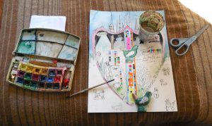
Work in progress, “Coat of Arms”,  2015

Something New

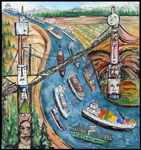
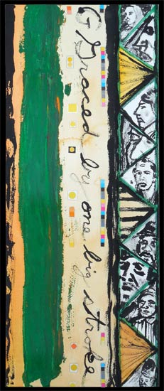
For a number of years I traveled from Pennsylvania to Michigan. Several times I crossed part of Canada to get there. The first image I finished this month was an attempt to join the feelings and sense of friendships made through the time and space of this travel. The other image I worked on reacted to and built from a big stroke of leftover paint I had applied to paper. The fact that this bold green mark contained remnants of orange pigment gave me an opening to expand the palette elsewhere on the page. Suddenly new possibilities opened up. The artistic image is not a perfect window for the past. Rather it conjures up relationships and a direction for the future. While I can’t be out on the open road at this time, I can begin to chart new vistas.

Title:Michigan Canada Crossing, Media: Watercolor, Ink, and Acrylic Paint, Size: 18″ x 16 ¾”
Title: Grace, Media: Watercolor, Ink, Acrylic Paint, & Collage, Size: 18″ x 7 ¼”

Nature’s Highlighter

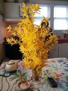
forsythia_on_table
Forsythia On the Table

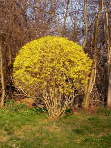
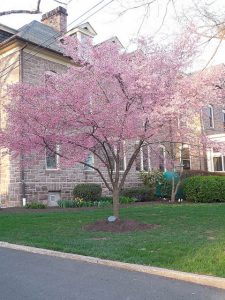
Forsythia may be one of nature’s most potent highlighters. In the spring it is a saturated yellow. When not pruned, the shrub can spread like the lemon hue highlighting of a reader who deems nearly every sentence of a book important. The way the natural world blooms has a pace. So far, cherry trees have turned pink and then come the apple blossoms. When my father preceded my grandmother in death,  she planted an ornamental cherry tree as a memorial to his life. Each year I look forward to seeing the tree turn pink and watch for its growth.

I am amazed that a weighted plastic headstone placed in front of this cherry tree has survived fifteen years. Usually I find the plastic stone tilted on its side, but I make a point to return it to its proper standing. There seems to be more to highlighting than making marks. In order to retain meaning, there is a need to return to passages and recall important details. Reflection also makes color richer (i.e. both the hue and the vibrance of life). Colors that create an emphasis are more than pretty accents. They are temporary developments that shape spaces and offer anchors in a world that can feel like a complex web of light and shade.

As promised in the last post, included below are a crop of photographs.

forsythia
Forsythia
cherry_tree
Ornamental Cherry Tree
head_stone
Headstone in front of the cherry tree.
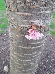
cherry_blossom
Cherry Blossoms

Threshold Between Notation and Notable

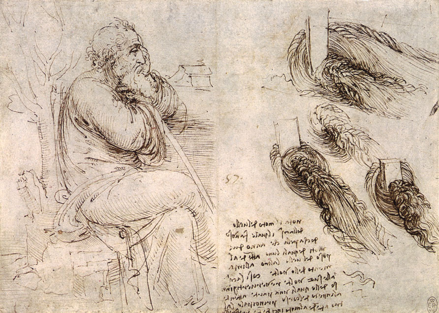
Leonardo da Vinci, Old Man and Water Studies, c. 1513

Lately, I have been thinking about how to maximizing visual exploration. When I was younger I felt I had more time to explore. How does one squeeze extra into less time? What kind of drawing best gets to the heart of a subject quickly and yields new insight? These questions caused me to think more about the thumbnail sketch.

As a student I dreaded thumbnail drawing and sensed many of my peers felt a similar way. These drawings often looked unsubstantial. It seemed to be about getting an idea out with little resolution. No matter how good the draftsman, I found the drawings fundamentally lacking. Even the masters most gestural drawings seem larger and more directed. This caused me to re-examine Leonardo da Vinci’s drawings. I tried to find the more wobbly and expedient looking drawings. I was struck how he could focus on the action of phenomena such as the movement of water (shown above) as well as how he would doggedly pursue a subject (e.g. as seen in the studies for the Trivulzio Monument). Da Vinci’s sketchbook becomes a symbol of monumental knowledge.

Leonardo da Vinci, Study for the Trivulzio Monument, c. 1508

Leonardo set a high bar for quality in a drawing journal. Perhaps for this reason, many of those artistically inclined have a drive to make the sketchbook an impressive object. The authority of the book as a form may give rise to the feeling that it must be filled in a spectacular way (leading viewers to continue to turn pages). For me this approach has been problematic. While the sketchbook is useful, it was not a format I wanted to invest a large amount of energy, and at times the thought of hundreds of blank pages felt like a trap.

Recently, I have been more devoted to digital drawing. It is appealing because elements can be shifted, re-arranged, and colors can be tested and altered while different versions may be saved. I enjoy the freedom this allows. However, I have found that the little tag sized drawings have a place. The thumbnail drawing does not require a book, special paper, or almost any other kind of barrier between the mind and hand.

One of the benefits of experience is that one is able to evolve past earlier biases. I held on to a prior assumption that thumbnails sketches were not colorful. Perhaps this is because color has a greater psychological connection with painting. Below are a collection of little drawings. While drawing quickly, here I labored in a way I had not previously. The marker became like a brush and in each drawing something new was discovered. While the discoveries did not seem monumental, my thinking was shifted, I found little surprises, and I was able to see potential. Perhaps this is like Leonardo’s water study, at the time it was made his sketch may not have seemed like much. However, the drawing did lead Leonardo further down the river toward wider deeper currents.

Thumbnail Collection, 2015