Libraries are one of my favorite places to hang out. I love being around books and people who love being around books. The library is a place of words. However, it is easy to forget that it is also a place of images. Printed images and picture are close kin to printed words. For this reason, libraries have extraordinary potential as places to exhibit art, in particular art related to words.
There is no place better to feel the aura of books, reading, and deep thoughts than at a big city library. The exhibit “Intaglio a Go-Go: Etching Moves Forward” at the Free Library of Philadelphia finds its home in this environment. The library is at 1901 Vine Street right off of the Ben Franklin Park Way. This is an exhibit of prints by Philadelphia area artists working with the intaglio process. Intaglio includes etching, engraving, dry point, aquatint and mezzotint. Artists exhibiting include: Cindy Back, Amze Emmons, David Fertig, Donald Forsythe, Carrie Scanga, Bill Scott, Evan Summer, Rochelle Toner, Shelly Thorstensen, and yours truely.
Another idiosyncratic aspect of library exhibits involves the display in cases rather than on austere white walls. Below are a few images of artwork in display cases. The following are works by artists I ran into at the opening.
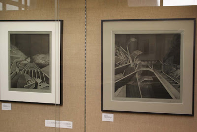
Above are prints by Evan Summer who has been a long time Professor at Kutztown University. Evan often makes images of complex, geometrically inspired landscapes. I was surprised to see his prints on a gray paper. This particular gray reminded me of zinc plates that etchings are often made from. It is as if he is making prints of the print matrix.
Rochelle Toner exhibited a number of prints (seen above) that demonstrates her working process. She is especially adept at making a copper plate print dark through aquatint and then scraping and burnishing areas of the plate to bring out a range of values.
Amze Emmons work (seen above) draws from contemporary industrially produced objects. These are objects that we often take for granted such as containers for gasoline or cement dividers. Through his fluid use of line and and flat minimal coloring he highlights the beautiful geometry of these items.
P.S. for more information visit www.friendsofpix.org


