(To learn more about the “Viewfinder Project” see the original post.)
 |
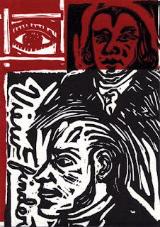
| Kip Deeds, “Viewfinder”, 6″ x 4 1/4″, 2005 |
After receiving “Viewfinders” from other artists, I began to think about the suggestive nature of the image initially sent out (seen above). The image sent was printed with two layers. First, a red was printed on white paper and then black was printed on top to provide detail. Given its saturation and contrast, the red had a powerful additive effect. I wondered if this choice influenced the recipients because much of the artwork returned was dominated by red. The approaches varied but the results were persistently on my mind.
Red is associated with dramatic appearances in nature (e.g as seen punctuated in the landscape in the form of flowers, as see in fleeting moments as the sun sets, in the details of a fire, or as blood when we are cut). Red has come to symbolize a sense of passion, vibrance, and at times danger. Perhaps for this reason red is also associated with other temporal states such as when one blushes or when one is angry (one can “turn red” and one can “see red”).
 |
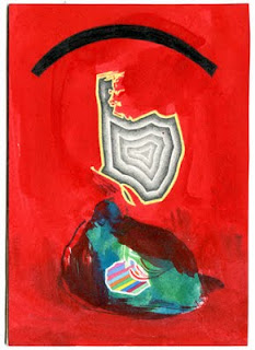
| John J. O’Connor, “Viewfinder”, 6″ x 4 1/4″, 2005 |
I can only guess at the system John J. O’Connor used to devise his “viewfinder”(seen above). O’Connor often uses complex data and text to point out highly directed and individualized results. He attempts to visualize mass information using his own idiosyncratic methods. Through his process he creates an abstract picture that in its wholeness captures a transcendent image.
Although John O’Connor’s artistic labor is serious, there is also something humorous and ironic about it. When his work uses information of a more politically volatile nature, he seems to be making light of officials who use statistics in selective and less than credible ways. Regarding one of his recent works, John O’Connor states how he used the “largest rises and largest falls in the history of the stock market, connected according to my own invented system. I juxtaposed and connected this structure with statements of great confidence and insecurity, revealed through hypnosis.”
 |
| Anne Stagg, “Viewfinder”, 4 1/4″ x 6″, 2005 |
Anne Staggs’s “Viewfinder”(seen above) refers to sewing and work stereotypically connected to women. However, Stagg’s sewing is not exactly the kind one may expect, the act is not about fashion or decoration but more about keeping “it” together. On her website, when referring to a related series of paintings, Anne described her initial inspiration “comes from a chore that my sisters and I were given when we were young. In order to prolong the life of our socks, my mom asked us to repair the socks that were wearing thin. We stretched them over a bare light bulb and darned them with sock yarn.”
Stagg’s paintings are unlike the “Femmages” (a kind of feminist collage using fabric) that Miriam Shapiro made in the 1970’s. Even though there is a relationship, one has to look harder to see the fabric (what is there both literally and figuratively). The white in the image is also intriguing because it is not the fabric. The white is the unknown icy hot light. In this case the viewer is shielded (or protected) and stitched inside a red sock.
 |
| Jason Urban, “Viewfinder”, 6″ x 4 1/4″, 2005 |
Jason Urban re-contextualizes commercial modes of production and often identifies imagery common in popular and mainstream culture seen through these modes. Urban gives prominence to the background content and details of reproduction processes (e.g. halftone patterns, screen savers, and raster images). By making the pixels more noticeable or by layering information in unpredictable ways (e.g. reproducing a screensaver image that is re-assembled on filing boxes) Jason allows us to consider what we usually overlook and see how this content can have new meanings. What I find compelling about the painting Urban returned to me (seen above) is that it appears unfinished. By recreating pixels by hand and by letting brush marks show, individual parts become prominent and interrupt a collective effect. In a digital realm, at the pixel level, this would be improbable if not impossible.
Taking the repetitious use of red further (and perhaps a bit outside of the realm of this project), I was reminded of the persistent use of the word “red” in the 1978 pop song “I See Red” by Split Enz. Although the artwork I received did not make me hopping mad, the song offers a humorous comparison between lyric and music on one hand and visual art on the other hand. The underlying psychological impact of this color makes itself present in manifest ways.