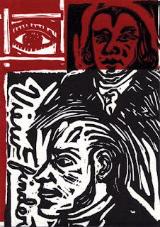
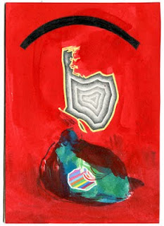
A View of the World Unclothed

(To learn more about the “Viewfinder Project” see the original post.)

Rarely do most of us scrutinize a person’s features beyond passing glances much less get a good look at a person unclothed. An essential aspect of drawing the figure from life is an intense study of form. Figure drawing is challenging in part because of judgements about proportions and shape. If the draftsman’s observations are off, then the rendering will look less like the model. Figure drawing is also one of the few opportunities to see the human body in an unobscured or unmediated way. After one draws from the figure it becomes easier to imagine or invent figures based on this study.
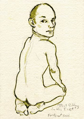
Heyd Fontenot’s “Viewfinder”, Paul Sitting On His Feet, 6 by 4 1/4 inches, Ink, 2006

Heyd Fontenot and Brian Jermusyk present a view of life unclothed. However, their work transcends mere study. Both artists offer a commentary on the way we live and the way we choose to see ourselves. They also use a comic style that mixes seriousness with humor. Fontenot will often draw and paint the unclothed figure coupled with animal counterparts. He also emphasizes the relationship between facial expressions and pose revealing a range of raw emotions such as surprise, boredom, disgust, and ecstasy. In the image Hyde sent to me (seen above) the figure appears to turn his head to the viewer, with a coy knowing look, while shifting the body to emphasize his back. Like old Hollywood movies there is mystery; we think we know what is there but we can not see everything.

Brian Jermusyk,”Viewfinder”, 4 1/4 by 6 inches, Graphite, 2006

Brian Jermusyk has worked on a series called The “T” Drawings which are informed and influenced by reading the published diaries of Kenneth Tynan. Jermusyk presents a complex view of the sexual being. Sex brings pleasure but attached are inevitable psychological and at times physical costs. Many of these drawings depict a seductive cycle of birth, life, and death all in the same image. When Jermusyk places these stages in close proximity a mixture of pain, pleasure, and anxiety feel palpable.

The drawing seen above seems to be a beginning piece to a narrative. This drawing appears to depict the curiosity found in recognizing another’s form as sensual. Given connections both in terms of subject and approach to other drawings included in the “T” series, the assumed result of this encounter point toward a scene of a birth amidst a specter of death. Although the idea of death can not be separated from birth, the latter drawings mentioned serves as a reminder of how dangerous birthing has been (and still is in certain parts of the world) to both mother and child.
Steve Keister’s View to the South and East

(To learn more about the “Viewfinder Project” see the original post.)

Recently, I finished reading the Hermann Hesse novel Journey to the East. There is an unassuming and mysterious character in this book named Leo. He turns out to be a person of utmost importance. Steve Keister reminded me a bit of this character. I worked with Steve for several years at Princeton University and I have always felt a certain balance and kindness about about him (his importance was always apparent to me).

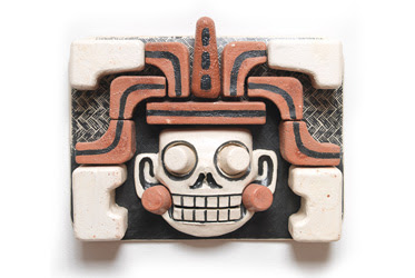
Steve Keister grew up in “Amish Country” (Lancaster PA). However, I feel his view has been consistently directed beyond the local (I suspect in order to explore the larger world and see it in a personal way). Keister spent time in Rome as an undergraduate student and later completed his Master of Fine Art degree there as well. Since the late 1970’s Keister’s work has been inspired by a study of pre-Columbian artwork and he has made numerous trips to Mexico.

Steve Keister, Skull Plaque III, Ceramic, 2010


What is fascinating about Steve is how he is able to see possibilities and look outward not only in a geographic, and historical way, but also in a material way. I was amazed to learn that Steve started out as a painter, became a sculptor, and then a ceramist. These changes don’t seem tentative, he set out for knowledge and a mastery.

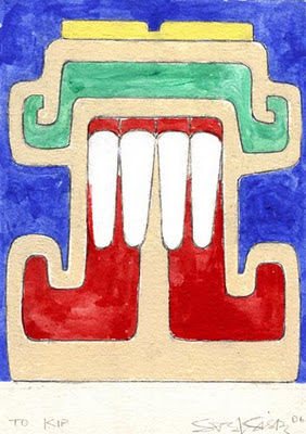
Steve Keister, Viewfinder, 6 by 4 1/4 inches,  Paint on Paper, 2006  


One aspect I fine most compelling about Keister’s work is how it skews a modernist time line of artistic advancement by pointing out cubist techniques often overlooked in the genius of earlier graphic and “craft” based works. Perhaps this ancient work did not get the attention it deserved because it’s exaggerations and graphic nature often pointed to humor rather than an overt seriousness. A wry sense of humor is apparent in Steve’s work. It is a subtle humor (without a punch line) related to the way one can see the world and choose to smile. It is the kind perspective one would imagine a Buddhist monk chuckling about. This leads me to believe (returning to my earlier connection with Hermann Hesse) that Steve Keister has also already made a “Journey to the East”.

For more about Steve Keister’s work visit his website also take a look at information about his exhibit at the University of Pennsylvania.

A View of the People by Shelley Spector

(To learn more about the “Viewfinder Project” see the original post.)

Shelley Spector’s “Viewfinder” reminded me of the the Occupy Wall Street movement. It is about ordinary people joining to do something bigger than themselves. I was heartened to read an article in the L.A. Times about how the Occupy Wall Street protesters are generally unexcited about celebrities coming to the protest and making a spectacle. They are concerned that their message (broadly defining problems of income disparity) may be co-opted and used for personal gain. Because Spector’s method appears direct she is able to create an image that feels like a spontaneous gathering and event comprised locals (similar to the assembly in New York). Hopefully, the Occupy Wall Street movement will be able to maintain a sense of independence and truly represent the people. This responsibility, much like the human tower depicted, is a tall order.

Shelley Spector, “Viewfinder”, 6″ x 4 1/4″, 2006


For more information visit Shelly Spector’s website. Shelley has also created a website called Art Jaw that fosters first hand accounts about the art community in Philadelphia.

Viewfinders: Persistently Red

(To learn more about the “Viewfinder Project” see the original post.)

Kip Deeds, “Viewfinder”, 6″ x 4 1/4″, 2005


After receiving “Viewfinders” from other artists, I began to think about the suggestive nature of the image initially sent out (seen above). The image sent was printed with two layers. First, a red was printed on white paper and then black was printed on top to provide detail. Given its saturation and contrast, the red had a powerful additive effect. I wondered if this choice influenced the recipients because much of the artwork returned was dominated by red. The approaches varied but the results were persistently on my mind.

Red is associated with dramatic appearances in nature (e.g as seen punctuated in the landscape in the form of flowers, as see in fleeting moments as the sun sets, in the details of a fire, or as blood when we are cut). Red has come to symbolize a sense of passion, vibrance, and at times danger.  Perhaps for this reason red is also associated with other temporal states such as when one blushes or when one is angry (one can “turn red” and one can “see red”).

John J. O’Connor, “Viewfinder”, 6″ x 4 1/4″, 2005


I can only guess at the system John J. O’Connor  used to devise his “viewfinder”(seen above). O’Connor often uses complex data and text to point out highly directed and individualized results. He attempts to visualize mass information using his own idiosyncratic methods. Through his process he creates an abstract picture that in its wholeness captures a transcendent image. 

Although John O’Connor’s artistic labor is serious, there is also something humorous and ironic about it. When his work uses information of a more politically volatile nature, he seems to be making light of officials who use statistics in selective and less than credible ways. Regarding one of his recent works, John O’Connor states how he used the “largest rises and largest falls in the history of the stock market, connected according to my own invented system. I juxtaposed and connected this structure with statements of great confidence and insecurity, revealed through hypnosis.”

Anne Stagg, “Viewfinder”, 4 1/4″ x 6″, 2005


Anne Staggs’s “Viewfinder”(seen above) refers to sewing and work stereotypically connected to women. However, Stagg’s sewing is not exactly the kind one may expect, the act is not about fashion or decoration but more about keeping “it” together. On her website, when referring to a related series of paintings, Anne described her initial inspiration “comes from a chore that my sisters and I were given when we were young. In order to prolong the life of our socks, my mom asked us to repair the socks that were wearing thin. We stretched them over a bare light bulb and darned them with sock yarn.” 

Stagg’s paintings are unlike the “Femmages” (a kind of feminist collage using fabric) that Miriam Shapiro made in the 1970’s. Even though there is a relationship, one has to look harder to see the fabric (what is there both literally and figuratively). The white in the image is also intriguing because it is not the fabric. The white is the unknown icy hot light. In this case the viewer is shielded (or protected) and stitched inside a red sock.

Jason Urban, “Viewfinder”, 6″ x 4 1/4″, 2005


Jason Urban re-contextualizes commercial modes of production and often identifies imagery common in popular and mainstream culture seen through these modes. Urban gives prominence to the background content and details of reproduction processes (e.g. halftone patterns, screen savers, and raster images). By making the pixels more noticeable or by layering information in unpredictable ways (e.g. reproducing a screensaver image that is re-assembled on filing boxes) Jason allows us to consider what we usually overlook and see how this content can have new meanings. What I find compelling about the painting Urban returned to me (seen above) is that it appears unfinished. By recreating pixels by hand and by letting brush marks show, individual parts become prominent and interrupt a collective effect. In a digital realm, at the pixel level, this would be improbable if not impossible.

Taking the repetitious use of red further (and perhaps a bit outside of the realm of this project), I was reminded of the persistent use of the word “red” in the 1978 pop song “I See Red” by Split Enz.  Although the artwork I received did not make me hopping mad, the song offers a humorous comparison between lyric and music on one hand and visual art on the other hand. The underlying psychological impact of this color makes itself present in manifest ways.

Billboards


This past spring I entered a contest where artists could submit designs for a billboard. There was a prescribed scale artists had to consider, but the was no limit on content.  I spent a weekend making three designs. My original idea was to make a very small print large and then offer commentary related to the imagery. Initially, I used rubber stamps (these I carved) to make small prints. After the prints were scanned, adjustments and additions were made in Adobe Illustrator.


Ultimately, my plans were rejected. However, I feel that the sayings and imagery offer something to consider.  Perhaps the traffic that passes through this site will give the billboard designs greater consideration than viewers might if they passed actual billboards by car. The design at the top depicts the age of the internet, but ironically it is made in a way that alludes to what is handmade and personal. The middle image reflects our habits and how they relate to one’s desire to fit in. The bottom image follows the path of history and how information and vision have been passed from place to place. Of course each mode has it’s advantage and disadvantage.